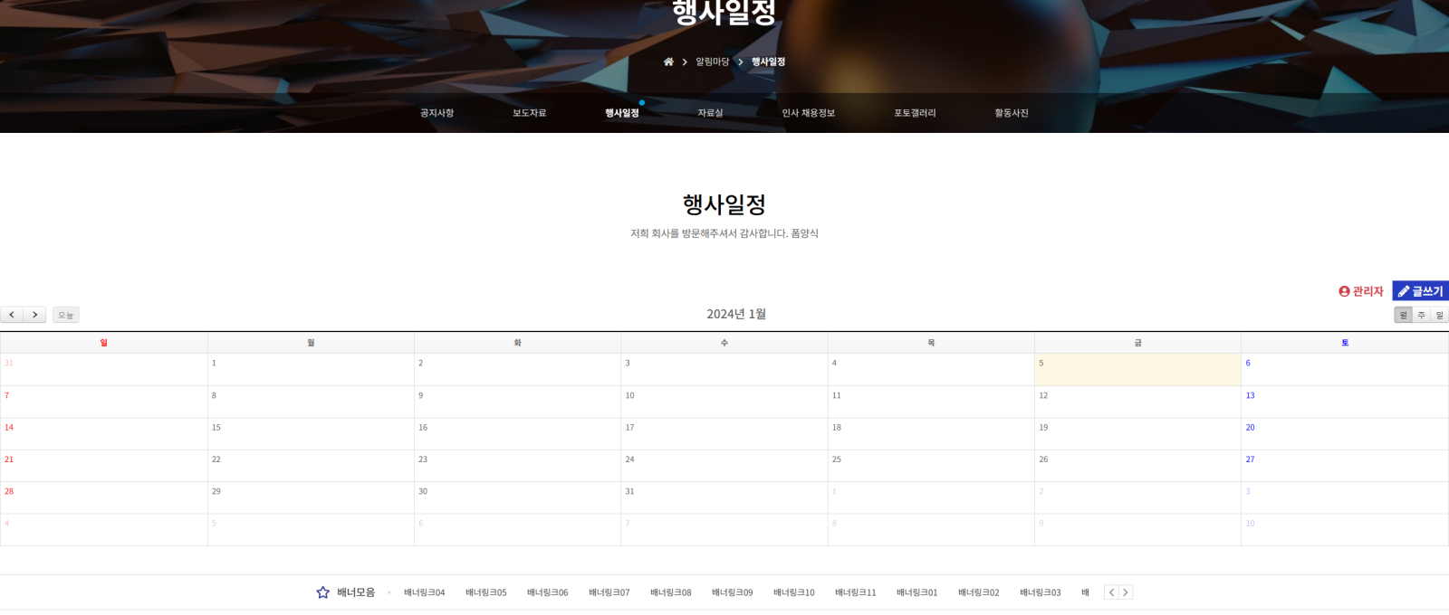 달력이이 사진에 보여지는거처럼 꽉차게 보입니다. 다른 게시판들도 그렇구요 수정을 해야할거 같은데 어디서 어떤 코드를 수정해야할지 모르겠습니다....

이페이지 처럼 보여져야하는데...
답변 3개 / 댓글 7개
채택된 답변
+20 포인트
2년 전
/theme/basic/css/common.css line 575
.sub_btit { text-align: center; margin-top: 10rem; margin-bottom: 7rem; }
=>
.sub_btit { width:800px;margin: 0 auto;text-align: center; margin-top: 10rem; margin-bottom: 7rem; }
/theme/basic/skin/board/190724schedule+v1.4/list.skin.php line 49
<div id="bo_list" style="width:<?php echo $width; ?>">
=>
<div id="bo_list" style="width:800px;margin:0 auto">
답변에 대한 댓글 6개
2년 전
/theme/basic/css/common.css line 575
[code]
.sub_btit { text-align: center; margin-top: 10rem; margin-bottom: 7rem; }
=>
.sub_btit { width:66%;margin: 0 auto;text-align: center; margin-top: 10rem; margin-bottom: 7rem; }
[/code]
/theme/basic/skin/board/190724schedule+v1.4/list.skin.php line 49
[code]
<div id="bo_list" style="width:<?php echo $width; ?>">
=>
<div id="bo_list" style="width:66%;margin:0 auto">
[/code]
이렇게 %로 수정하세요.
[code]
.sub_btit { text-align: center; margin-top: 10rem; margin-bottom: 7rem; }
=>
.sub_btit { width:66%;margin: 0 auto;text-align: center; margin-top: 10rem; margin-bottom: 7rem; }
[/code]
/theme/basic/skin/board/190724schedule+v1.4/list.skin.php line 49
[code]
<div id="bo_list" style="width:<?php echo $width; ?>">
=>
<div id="bo_list" style="width:66%;margin:0 auto">
[/code]
이렇게 %로 수정하세요.
nanase
2년 전
https://kofod2000.mycafe24.com/bbs/board.php?bo_table=basic_type01
이페이지에 경우 게시판 형식인데 얘들도 비슷해서요
이페이지에 경우 게시판 형식인데 얘들도 비슷해서요
2년 전
/theme/basic/skin/board/so_pbda/list.skin.php
[code]
<div id="bo_list" style="width:<?php echo $width; ?>">
=>
<div id="bo_list" style="width:66%;margin:0 auto">
[/code]
필요한 곳을 위 처럼 수정 하세요.
[code]
<div id="bo_list" style="width:<?php echo $width; ?>">
=>
<div id="bo_list" style="width:66%;margin:0 auto">
[/code]
필요한 곳을 위 처럼 수정 하세요.
2년 전
html
Copy
...

<!-- <div id="bo_list" style="width:100%"> -->

<div id="bo_list">

...
css
Copy
#bo_list {

    margin: auto;

    width: 80%;

}
2년 전
반응형 이라서 월래그래요 ;;; 만약에 pc에서는 화면을 다르게 보게 하고싶다면 css 에서 수정해주면됩니다. 사이즈에 맞게요
답변에 대한 댓글 1개
2년 전
@media (max-width: 1024px) {
#hd, #wrapper, #ft { min-width: 100% }
#hd_pop, #hd_wrapper, #tnb .inner, #gnb .gnb_wrap, #container_wr, #ft_wr, .td_board { width: 100% }
}
이것은 맞지않을수도있으니 이런식으로 하면됩니다. 만약 pc에서 다르게 보이게 하고싶다면 해당 미디어를 찾아서 수정해줘야할것입니다. 그리고 레이아웃을 피시형일때 레이아웃을 잡아주시면됩니다.
#hd, #wrapper, #ft { min-width: 100% }
#hd_pop, #hd_wrapper, #tnb .inner, #gnb .gnb_wrap, #container_wr, #ft_wr, .td_board { width: 100% }
}
이것은 맞지않을수도있으니 이런식으로 하면됩니다. 만약 pc에서 다르게 보이게 하고싶다면 해당 미디어를 찾아서 수정해줘야할것입니다. 그리고 레이아웃을 피시형일때 레이아웃을 잡아주시면됩니다.
답변을 작성하려면 로그인이 필요합니다.