
320x100 단위가 새로 생겼군요!
기존의 320x50은 너무 작아서 눈에 안 띄고, 300x250이나 336x280은 너무 커서 컨텐츠를 저~ 아래로 밀어내버리는 불편함이 있었는데,
새로 추가되었다는 320x100 단위는 딱 그 중간으로 적절하게 잘 만든 것 같네요. ㅎㅎ
앞으로 많이 쓰게 될 것 같습니다~
참고 내용:
Dear Publisher,
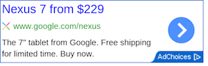
We’re happy to let you know that we’ve just launched a new 320x100 Large Mobile Banner ad unit.
We’re happy to let you know that we’ve just launched a new 320x100 Large Mobile Banner ad unit.
This new ad format is especially suitable for High End Device sites.
[actual image]
[How to create the new ad format]

To ensure you are always getting the best results from your ad units, our ad serving process enables our larger ad units to serve similar-sized display ads. You may occasionally see a 320x50 ad served in your 320x100 with the most competitive ad served, thus maximizing the earnings on your ad unit. When a 300x50 ad is served it will be centered in the 300x100 ad unit.
[actual image]
[How to create the new ad format]
- Visit “My Ads” tab in your AdSense account
- From the sidebar, choose “Ad Unit” under "Content"
- Click +New ad unit
- From the Ad Size top down menu you can choose the new format 320x100
To ensure you are always getting the best results from your ad units, our ad serving process enables our larger ad units to serve similar-sized display ads. You may occasionally see a 320x50 ad served in your 320x100 with the most competitive ad served, thus maximizing the earnings on your ad unit. When a 300x50 ad is served it will be centered in the 300x100 ad unit.
See you online,
The Google AdSense Team
The Google AdSense Team
|
댓글을 작성하시려면 로그인이 필요합니다.
댓글 7개
좀 두고 봐야 할 것 같습니다.
제 느낌에 광고 수가 제일 다양한 건 336x280인 것 같더라고요!
냑이 예전에 336*280 돌릴 때 300*250 이 대체되어서 뜨는 경우가 자주 있었거든요.
저는 728*90, 200*200 이 레이아웃 관점에서 봤을 때 가장 안정적인 것 같아요.
컨텐츠아래나 위에 심으면 클릭율이 높게 나오더군요
반응형이라도 사이즈별로 정보를 알려주면 좋을텐데...